An AI-assisted geospatial experience for government teams protecting food and water resources during disasters.
My role
Co-lead · Project management · UX research · Design strategy
Team
15 students · 7 majors
Design cycle
10-week studio · 2024
Outcome
Functional MVP
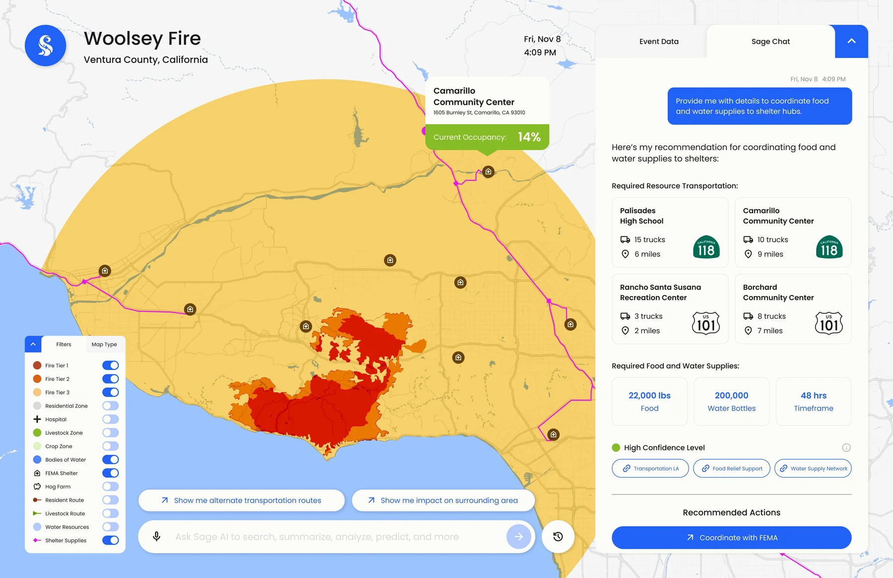
Resource planning · final SAGE interface01 / SAGE
The brief: problem, people, proof
Our SCADpro team worked with Deloitte to develop SAGE. As co-lead I owned project management, UX research and design strategy, shaping wireframes with the design team from research to a functional MVP.
The problem
Data everywhere. Decisions nowhere.
Extreme weather can wipe out a season’s crops or destroy water infrastructure. Government teams struggle to pull actionable insight from disparate data sources, so allocating scarce food and water turns into guesswork under pressure.
For whom
Two government decision-makers.
Resource Managere.g. an Emergency Management Director. Needs real-time geo-data, fast deployment and clear coordination across agencies.
Long-Term Plannere.g. a Chief Sustainability Officer. Needs forecasts and strategies that keep food and water resilient.
What we designed for
Time to actionFrom alert to a response plan in as few steps as possible. In emergency management, lost time never comes back.
First-click successCan users find the right starting point without help? Tested with 8 users.
Trust in AI outputEvery recommendation shows its confidence level and the data behind it.
23%of Californians face food insecurity
40%of California’s water goes to agriculture
6expert interviews
4rounds of expert and user feedback
Context from the project’s state research; counts from our research and testing.
02 / SAGE
What these teams already have — and why it isn’t enough
Before drawing a single screen we took apart the platforms these agencies use today. Five public systems, each read for what it does well, where it fails a decision-maker, and the opening it leaves behind.
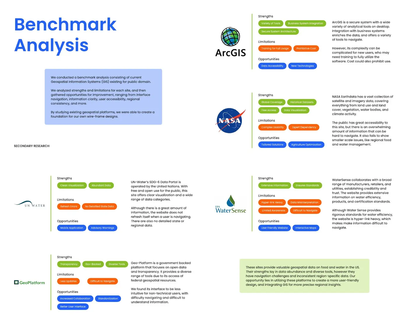
Benchmark analysis — strengths, limitations and opportunities across five public geospatial platforms Process book · PDF p. 17–18 · Open image ↗
ArcGISDeep analytical tooling and secure architecture — and it needs training and a budget before anyone gets an answer out of it.
NASA EarthdataSatellite coverage of the entire planet, free to anyone, with nothing to say about a single county.
UN-Water SDG-6 portalClean visualisation across many categories; no state or regional detail, and it does not refresh while you work.
GeoPlatformGovernment-backed and transparent, with an interface non-technical users struggle to move through.
WaterSenseAuthoritative standards buried under a hyperlink tree.
The opening
Every platform is strong on data and weak at the moment of decision: abundance, inconsistent regional detail, and navigation that assumes expertise. That gap is where SAGE was designed to sit.
We also looked outside government — mobility and foot-traffic analysis, indoor airport routing, stadium wayfinding, the digital twin of Paris built for the 2024 Olympics — to see what geospatial looks like when it is built for ordinary people rather than analysts. Real-time tracking, plain visual language and services shaped around a single task all came back into our own design.
03 / SAGE
Narrow the scenario to deepen the design
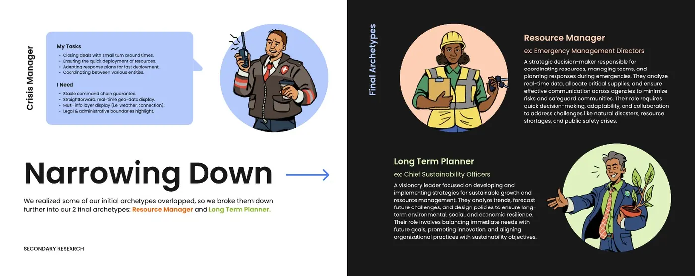
We initially explored Texas and five government-user archetypes. Deloitte’s feedback pushed us to narrow the user groups while widening the research context across California, Iowa and Texas.
Starting point
Texas · five government-user archetypes · a broad geospatial toolset.
Focused scope
California wildfires · Resource Manager and Long-Term Planner · research across California, Iowa and Texas.
The decision
Focus the design on two users and use California wildfires as a concrete scenario. The scenario made the relationship between immediate response and future food and water resilience easier to test.
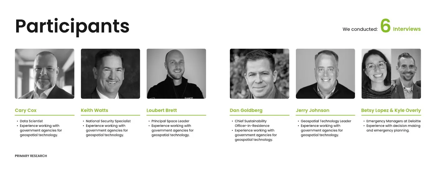
Secondary research covered existing platforms, data sources, policy and resource distribution. Six expert interviews then helped the team understand data integration, emergency coordination and decisions made with delayed or imperfect information.
Five archetypes — crisis manager, data integrator, policy advocate, resource allocator, long-term planner — resolved into two Process book · PDF p. 22–23 · Open image ↗
Widening the research meant three states instead of one: California, Iowa and Texas — top agricultural exporters with different climates and different disasters, which let us cross-check what food and water scarcity looks like across the country.
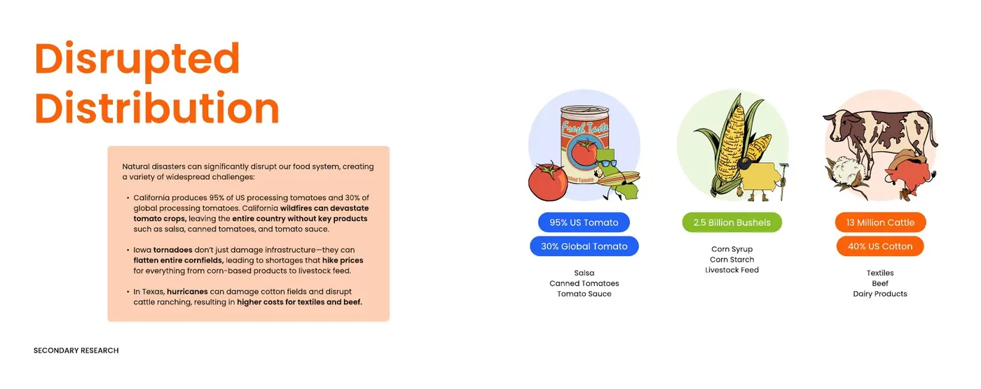
Why a regional fire is a national problem — California alone grows 95% of US processing tomatoes Process book · PDF p. 41 · Open image ↗
That is the argument for the scenario. A fire in Ventura County is not a county-sized event: it moves through processing, transport, distribution and retail until it reaches a shelf. California produces 95% of America’s processing tomatoes and 30% of the world’s; Iowa tornadoes flatten the corn that feeds livestock; Texas hurricanes take cotton and cattle with them.
04 / SAGE
Six experts, and the instruction they all gave
Secondary research tells you what exists. It does not tell you what it feels like to decide. We wrote a structured guide, kept the questions open, ran think-aloud sessions, and themed every answer into usage, pain points and opportunity.
Six practitioners across data science, national security, space, sustainability and emergency management Process book · PDF p. 48 · Open image ↗
A data scientist“We don’t know what data we’re missing; we maximise what we have with tooling.” Fusing imagery, road and mapping data at different resolutions is still the core problem — and end users have to be able to trust the algorithm.
A national security specialistA twenty-four-hour processing turnaround blocks instant decisions, and AI has to be trained carefully before it is trusted with sensitive calls.
A space leaderSatellites give a cheap, repeatable revisit to a site — water levels, soil moisture, methane. Sustainability officers now need that data to report against climate goals.
A chief sustainability officer-in-residenceLIDAR located the largest debris after a disaster and redirected crews — “in the world of emergency management, you can never get back time.”
A geospatial technology leaderFEMA coordinates through the Incident Command System; the hard part is balancing household-level data against privacy, and cutting through the sheer volume.
Two emergency managersFEMA lifelines — water, energy, health — are assessed first. Priority follows population, so rural areas lose to cities, and local windshield surveys still fill the gaps.
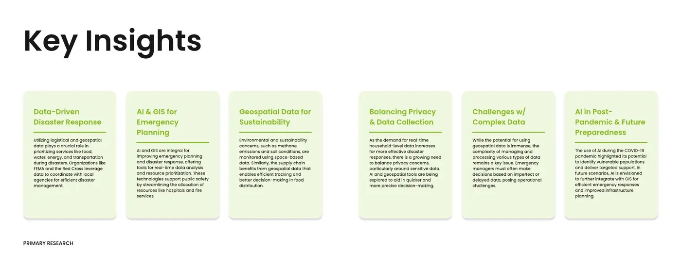
The synthesis — six themes that became the brief for the interface Process book · PDF p. 58 · Open image ↗
Six conversations, one consistent instruction: fewer surfaces, faster answers, and a visible reason to believe them.
05 / SAGE
What we were designing against
A brief this domain-heavy arrives with rules attached. Some came from the client, some from the data itself, and some from the people who would have to act on whatever we made. Every one of them left a mark on the interface.
No reference interfaces. On purpose.Deloitte gave us no screenshots of the systems their teams actually use. Nothing to redraw, nothing to “modernise”. The client wanted the design to drive the interface completely — which meant every screen had to be argued from research: what this person needs to know, in what order, to make the next decision. It was the hardest constraint and the most valuable one. With no incumbent layout to defend, nothing stopped us from throwing the whole structure out when the research said to.Decisions get made on imperfect dataEmergency managers act on data of varying confidence, and a twenty-four-hour processing turnaround was described to us as high. The interface could not pretend to certainty it did not have.It has to work in the fieldPhones and tablets struggle with the volume of geospatial data on site. That ruled out a heavy GIS canvas as the primary view and pushed us toward an answer plus a focused map.Nobody acts on a number they cannot traceTrust in third-party data and in algorithms came up in every interview. So every AI output carries a confidence level and a route back to the database it came from.Written for a non-technical readerReviewers told us to design for an older generation of users and to say what terms like “at risk” actually mean. Labels and time frames had to be explicit rather than expert shorthand.How close you can look is limitedHousehold-level detail would sharpen targeting, but privacy makes it contested ground. We kept the interface at zone, shelter and route level.Ten weeks, fifteen people, seven majorsSix countries and seven disciplines on one file. Scope had to be fixed early and defended, which is exactly why the client pushed us to cut five user archetypes to two.
“We are drowning in data; the real need is for fewer, more intuitive applications that can provide immediate, actionable answers for responders.”
Geospatial technology leader · expert interview
That line is the brief behind the brief. Every constraint above points the same way: less surface, fewer steps, and a reason to believe what the screen says.
06 / SAGE
Paper to pixels, and the note that changed the story
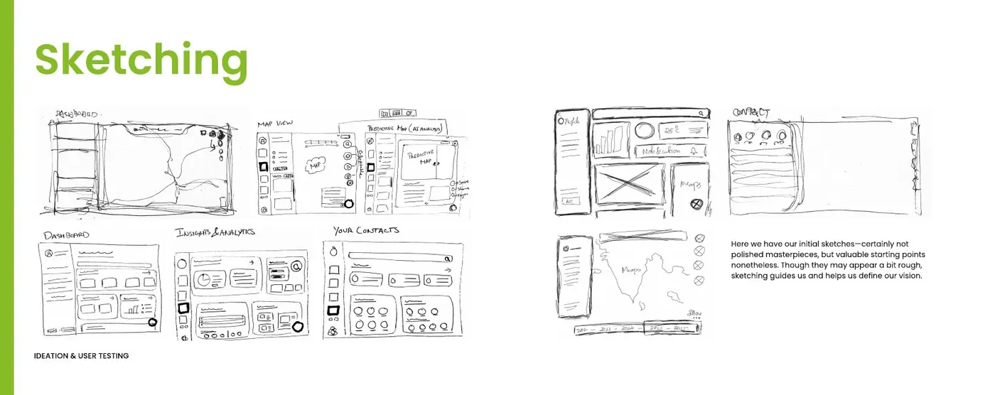
We started on paper — structure first, then a screen at a time — and took critique between every fidelity step rather than at the end.
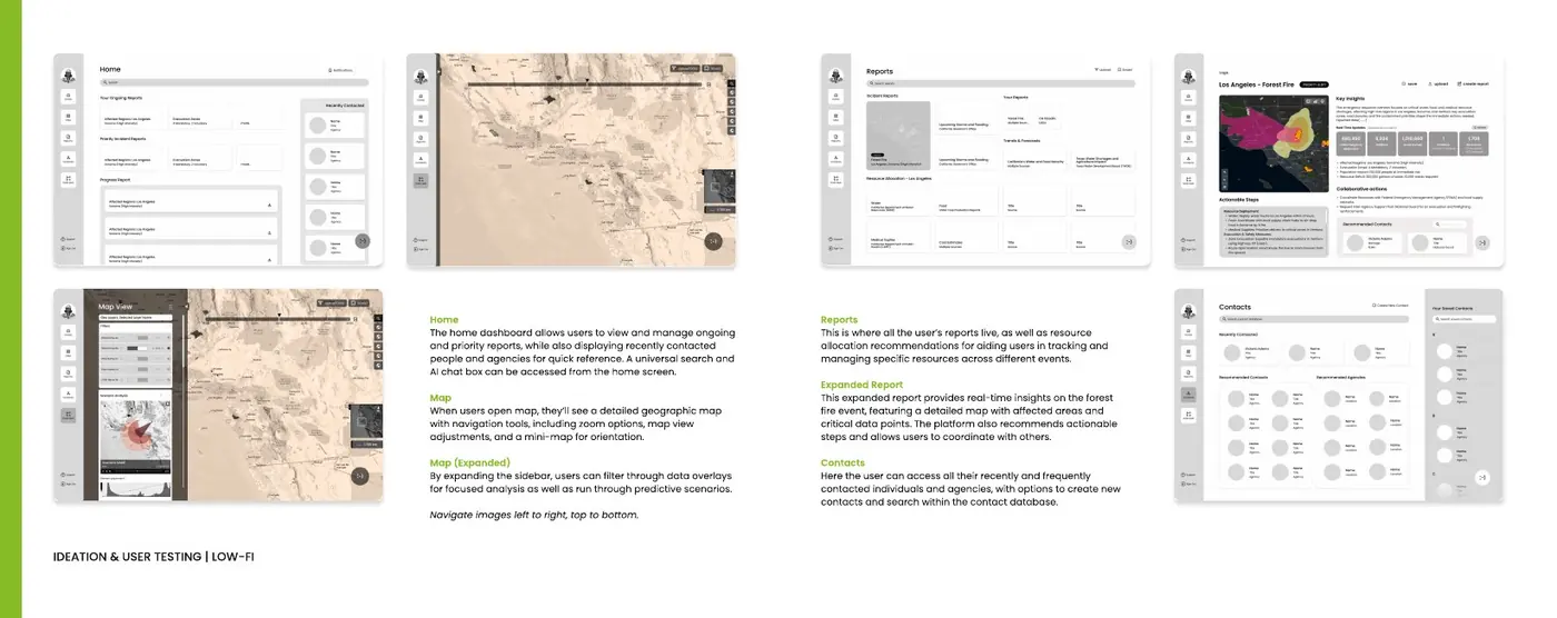
Sketches first. Rough on purpose: they settle structure before anything is worth drawing properly Process book · PDF p. 62 · Open image ↗Low fidelity — home, map, reports, contacts and data hub, laid out like a conventional platform Process book · PDF p. 64 · Open image ↗
First critique
Two things came back. From our mentor: rebuild the information architecture, vary the layouts, simplify, and integrate the AI deliberately instead of bolting it on. From the room: stop designing like the platforms we had just benchmarked.
The second checkpoint with Deloitte was blunter, and more useful: we needed a narrative. Not a feature set — a realistic scenario with a beginning, a turn and a resolution. A California wildfire. A short-term responder and a long-term planner. Consequences that land on food and water.
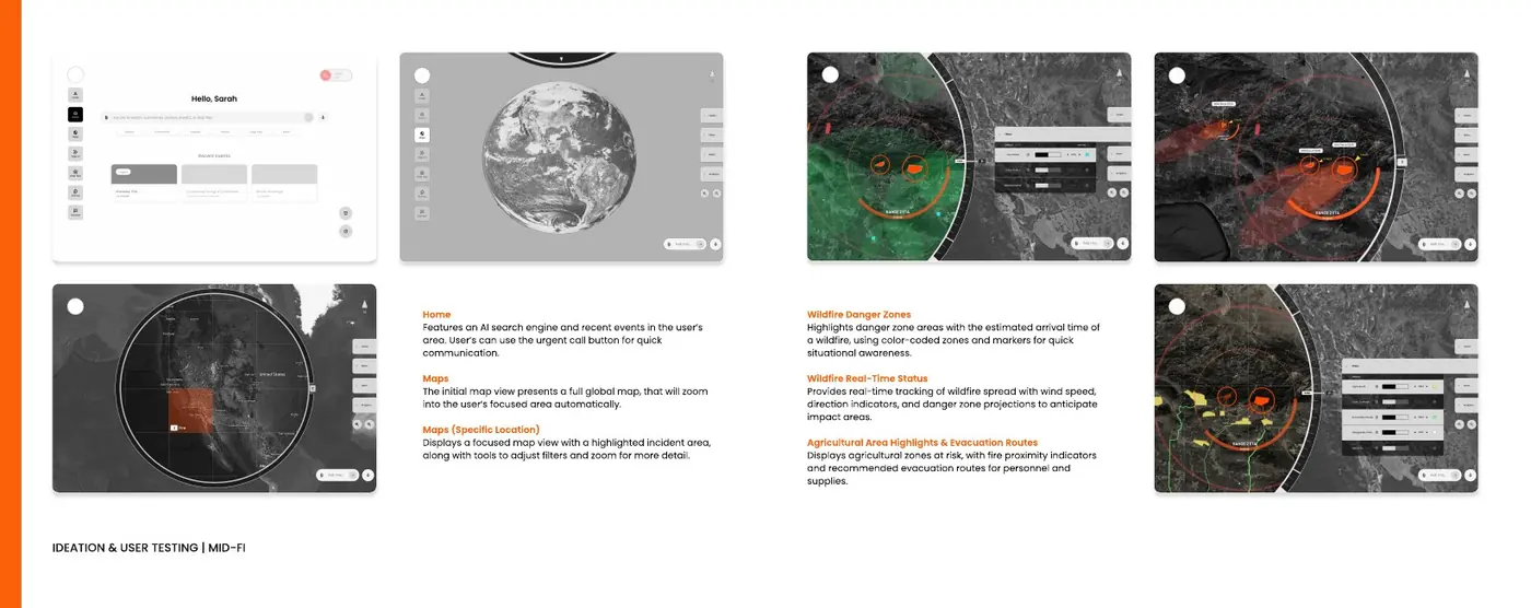
Mid fidelity, rebuilt around one wildfire — danger zones, live spread, farmland at risk, evacuation routes Process book · PDF p. 72 · Open image ↗
That note is what made the next chapter possible. Once the work had to carry a story, the question stopped being “what can this tool show?” and became “what does this person need next?”
07 / SAGE
The pivot: the user is not a “map person”
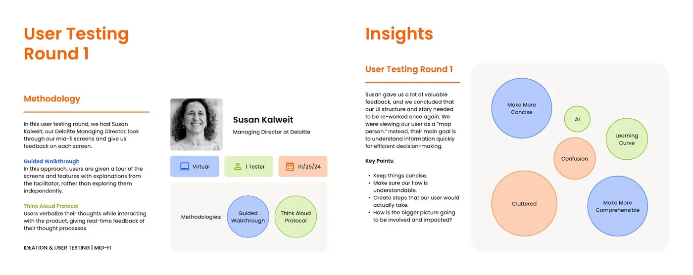
An early interface organized the experience around maps, reports and datasets. A guided review with a Deloitte managing director exposed a more useful framing: the user’s job was to understand the situation quickly and choose an action, not navigate a geospatial tool.
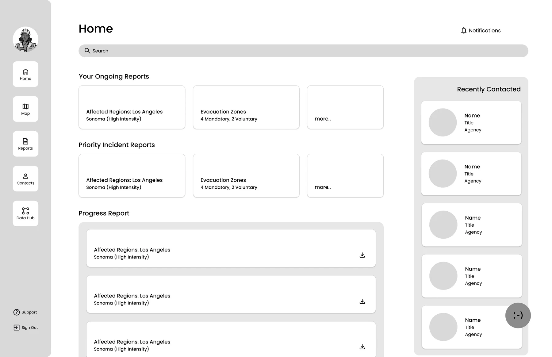
Before · Home
123
Report dashboardOngoing and priority reports compete for attention.
Progress reportsProject tracking takes the prime space.
Recently contactedPeople, not the emergency, anchor the side rail.
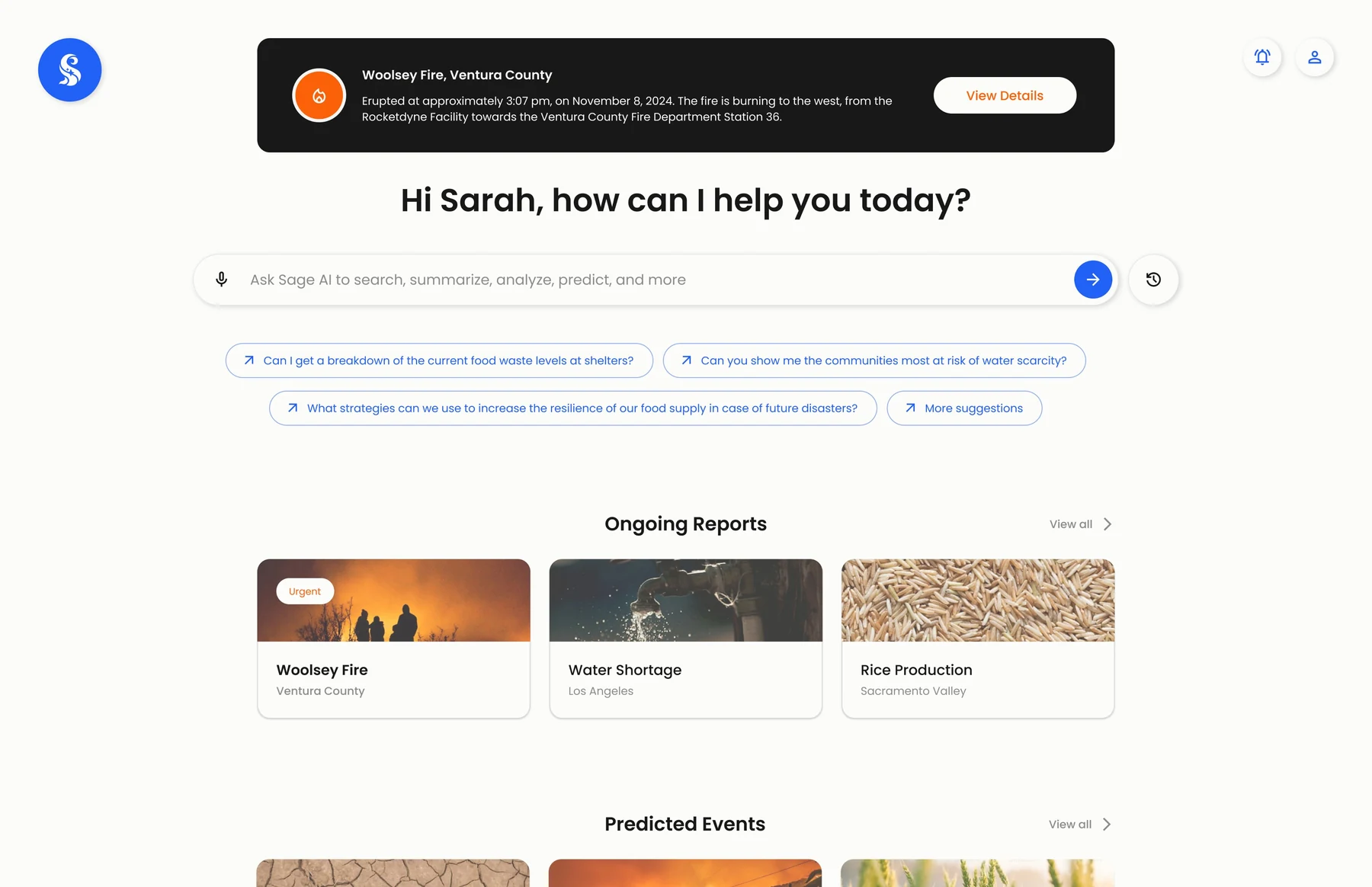
After · Home
1234
Live alert firstThe active emergency sits on top, one click from its event map.
Ask, don’t huntAn AI search replaces digging through datasets.
Suggested questionsRecommended prompts give a one-click path.
Ongoing and predicted eventsReal-time reports sit beside AI-forecast events.
Decision: lead with the situation and a question, not a wall of tools.
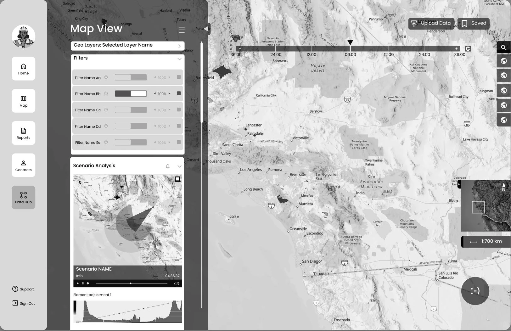
Before · Map
1234
Tool-first sidebarFeatures before the situation.
Layer filtersUsers configure data before they see the event.
Analysis chartsScenario charts need expert reading.
Whole-state mapNo event in focus.
After · Event map
1234
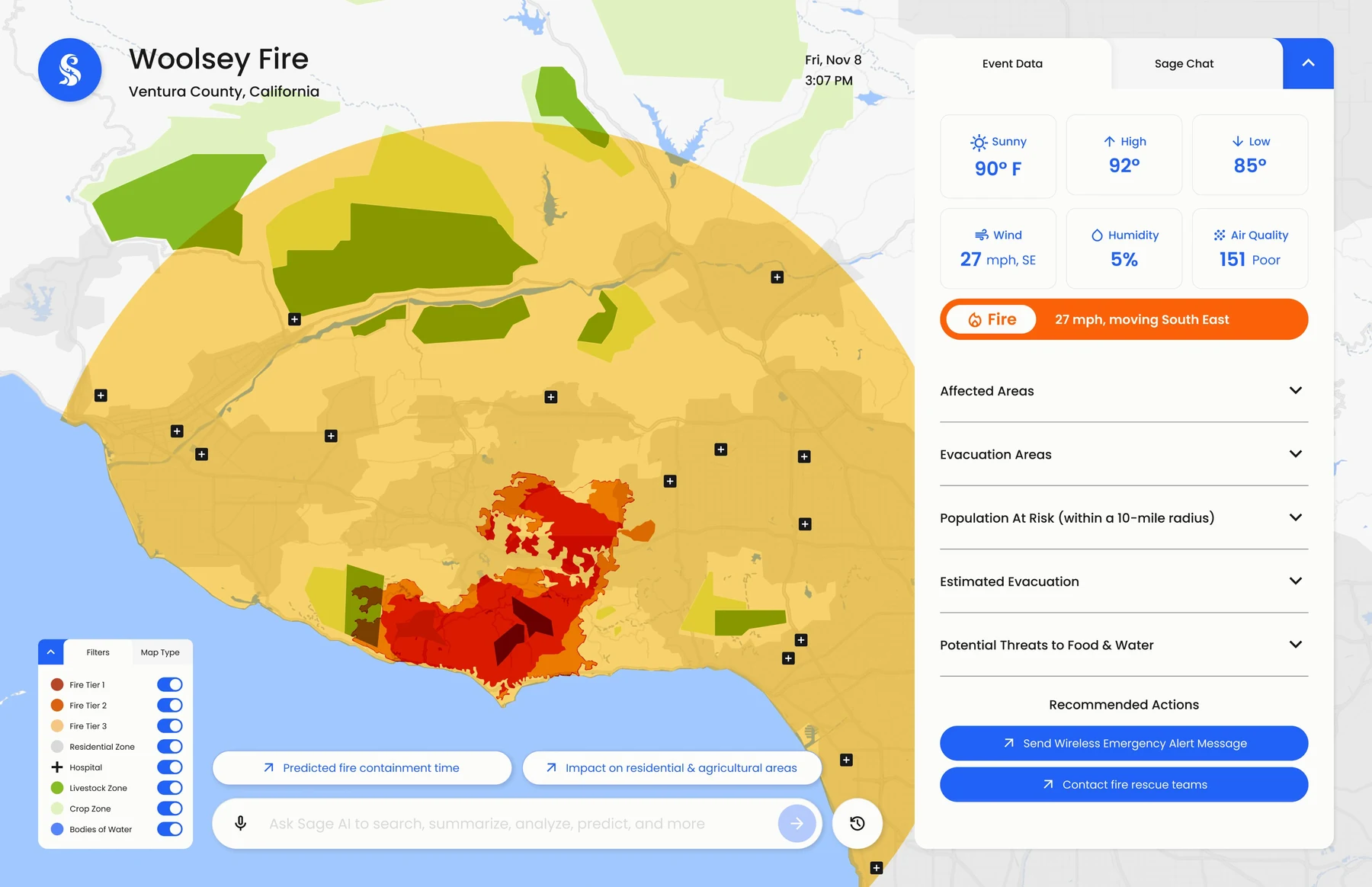
Live event dataTemperature, wind and fire direction at a glance.
Reduce clutter and show the steps a decision-maker would actually take.
02 · Language
Clarify labels such as “at risk” and make time frames explicit.
03 · Hierarchy
Use collapsible information, filters and action-oriented calls to action.
04 · Navigation
Improve chat-to-map transitions and clarify water, agriculture and safety information.
The team redesigned the interface repeatedly rather than treating the first visual direction as settled; the final design reflects what each review revealed.
Round one — the guided walkthrough that produced the “map person” insight Process book · PDF p. 74 · Open image ↗09 / SAGE
Access → analyze → act
SAGE connects an AI-powered search entry point with real-time event views, evacuation planning, resource allocation and post-event reporting. The Woolsey Fire scenario links those capabilities into one decision sequence.
AccessEssential geospatial data in one place, reached by asking a question.
AnalyzeRisk zones and predictive models turned into decision-ready visuals.
ActReal-time alerts and recommended actions for a coordinated response.
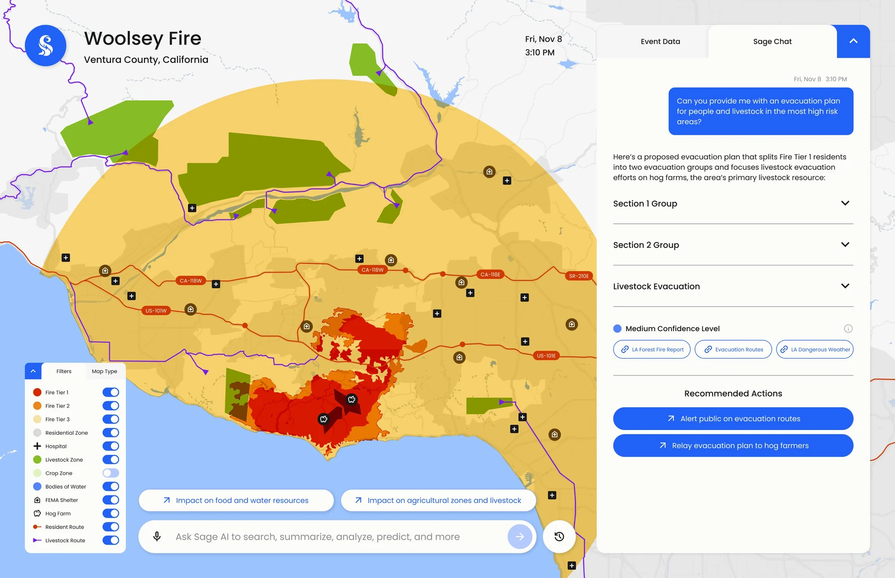
Evacuation planning
123456
Livestock routesFarm animals get their own evacuation paths.
Resident routesResidents are split into groups to ease road congestion.
Plan in chatThe AI drafts an evacuation plan from a plain question.
Confidence and sourcesA confidence level and the datasets behind the plan.
Recommended actionsAlert the public; relay the plan to local farmers.
Ask SageFollow-up questions without leaving the map.
Resource planning
12345
Shelter occupancyLive capacity for each shelter on the map.
Truck logisticsTrucks and distance per shelter.
Required suppliesFood, water and the timeframe to deliver them.
High confidenceSources linked for every figure.
Coordinate with FEMAOne tap to bring in federal support.
Trust is a visible part of the interface.
Every AI recommendation shows a confidence level and links back to its original databases, so users can judge the strength and source of a recommendation before acting on it.
Medium confidenceCalifornia ReservoirsVentura LivestockSoil Health Affected
High confidenceTransportation LAFood Relief SupportWater Supply Network
10 / SAGE
One fire, two people, ten days
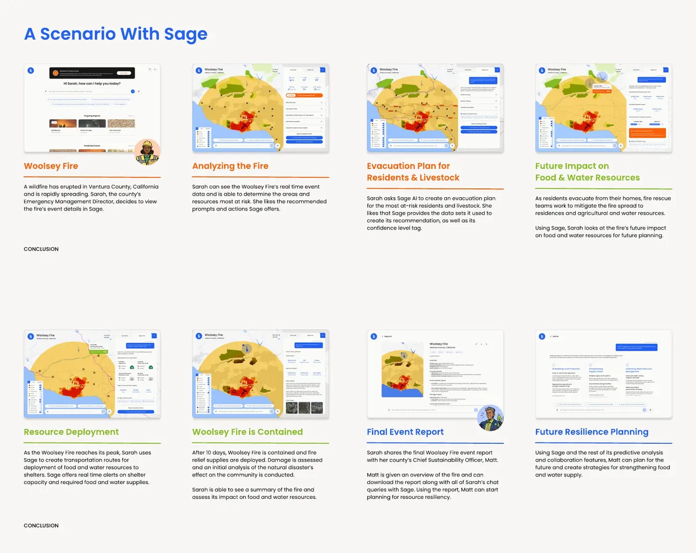
The whole system had to hold together as a single sequence, so we ran it as one: the Woolsey Fire in Ventura County, from the first alert to the resilience plan that outlives it.
The scenario end to end — Sarah, an Emergency Management Director, then Matt, a Chief Sustainability Officer Process book · PDF p. 109–110 · Open image ↗
The alertA wildfire erupts and spreads. Sarah opens the event, not a map.
Read the situationLive event data shows which areas and which resources are most at risk.
EvacuateShe asks for a plan for at-risk residents and livestock, and gets the datasets and a confidence level with it.
Look past the fireWhile crews work, she checks its future impact on food and water resources.
DeployAt the peak, transport routes carry food and water to shelters, with live capacity and required supplies.
ContainedTen days later, damage is assessed and the impact on food and water summarised.
Hand overThe final report goes to Matt, the county’s Chief Sustainability Officer — with every question Sarah asked along the way.
Plan for the next oneMatt works from the same system to strategise for food and water resilience.
The handoff is the point. The Resource Manager’s ten days become the Long-Term Planner’s starting document — one system, one evidence trail, two horizons.
11 / SAGE
The outcome
Functional MVPCarried forward by Deloitte15 students · 7 majors
The project delivered a functional MVP, which Deloitte carried forward as the foundation for the next phase.
The next step is task-based testing with resource managers and planners using realistic data latency and failure scenarios, measuring time to action, first-click success and trust in confidence labels.
My takeaway: when the stakes are high, a richer map is not automatically a better interface. The design has to connect the evidence, its uncertainty and the next action.
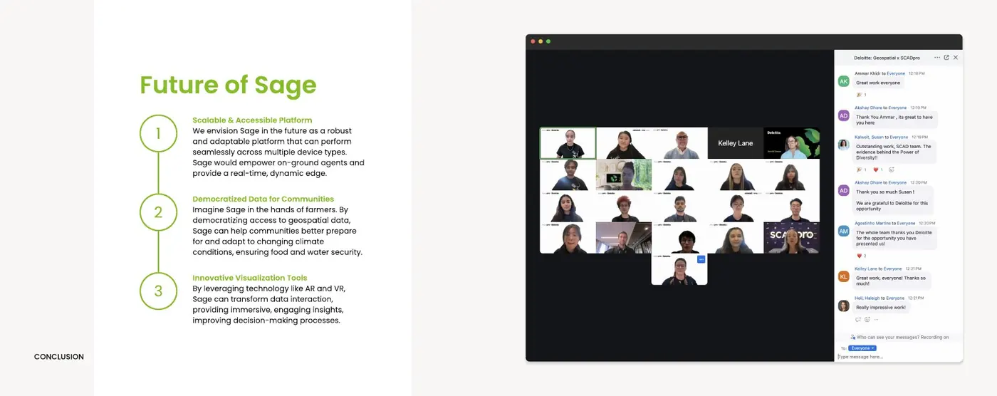
Where it goes next — multi-device in the field, data in the hands of farmers, immersive visualisation Process book · PDF p. 112 · Open image ↗
Three directions were set out for a next phase: a platform that performs across devices so on-ground agents get the same edge; the same data democratised for farmers and communities rather than agencies alone; and immersive visualisation for the point where a flat map stops being enough.
12 / SAGE
Made by a multidisciplinary team
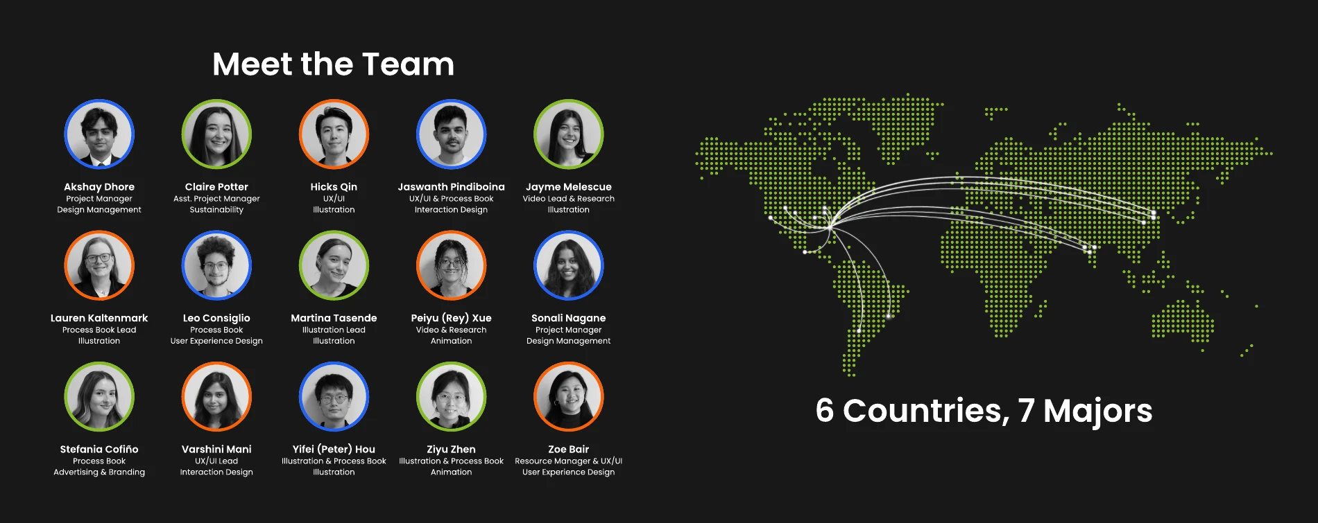
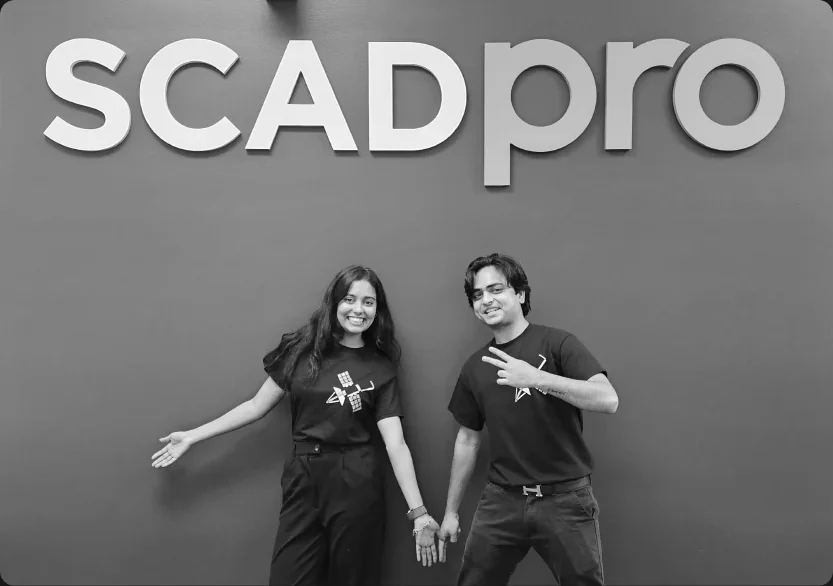
The SCADpro team behind SAGE Process book · PDF p. 9 · Open image ↗Co-leading SAGE at SCADpro Process book · PDF p. 114 · Open image ↗
Teamwork made it possible to connect domain research, interface design, visual storytelling and a working prototype across 15 students and 7 majors.