OPEN-SOURCE DESIGN SYSTEM · FIGMA + CODE + AI GUIDANCE
One Li8
The decisions travel with the components.
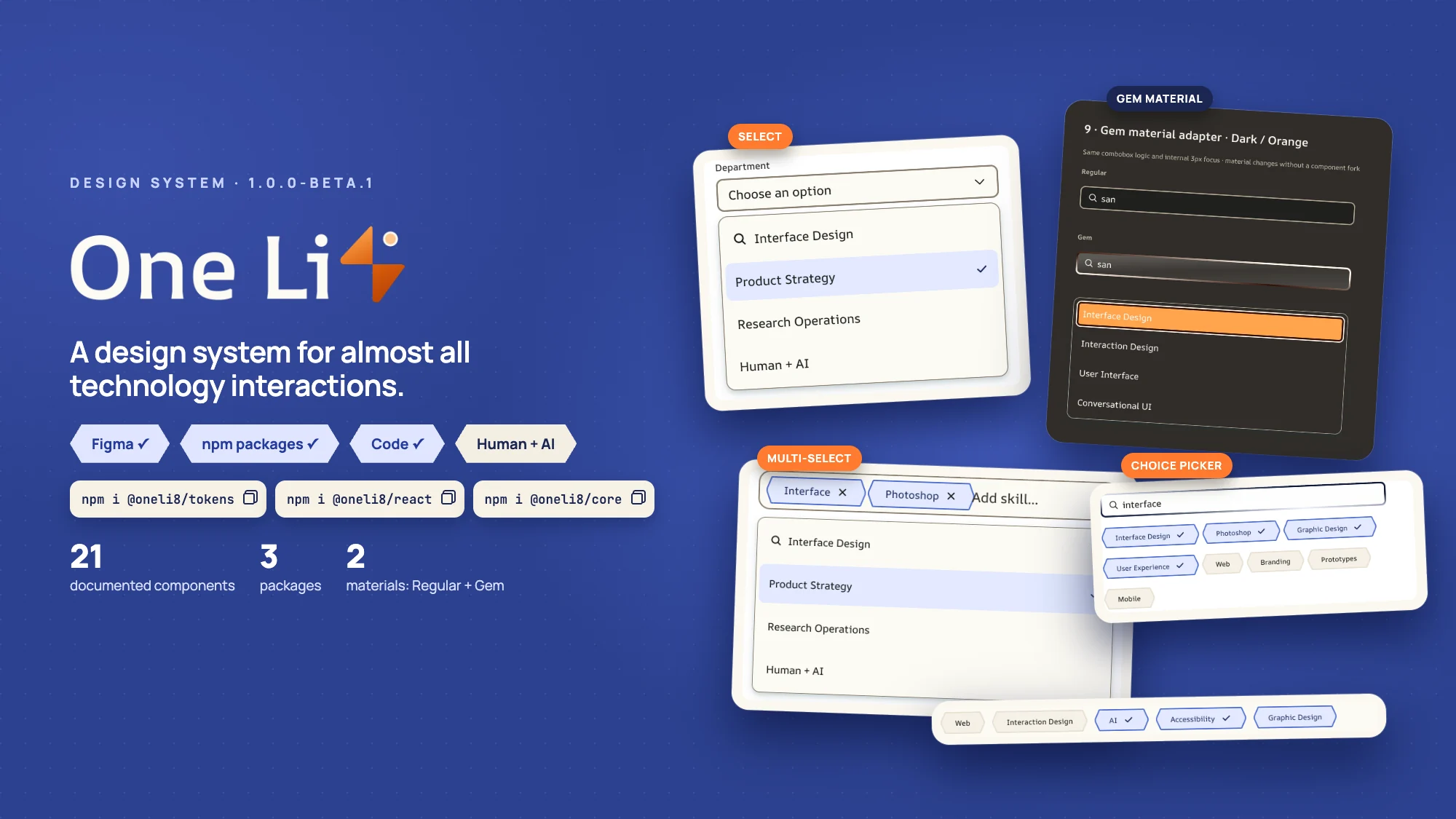
An open-source design system I created, named One Light. Its visual rules, naming grammar, materials and reasoning travel with every component, from Figma to React, Core and Tokens.
Role
Creator & designer
Release
Open source · 1.0.0-beta.9
Outputs
React · Core · Tokens
Approach
Design-led AI collaboration
One Li8 · 1.0.0-beta.901 / One Li8
The brief: problem, people, proof
One Li8 is an open-source design system I created. I own every design decision, working with AI across implementation and verification. It is built so the reasoning ships with the components, not in a wiki someone forgets to read.
The problem
Design and code drift apart.
A design system easily splits into separate realities: a Figma library, token files, application code and documentation that gradually stop agreeing. One Li8 makes shared design decisions part of the deliverable.
For whom
Everyone who ships interface.
Product designersNeed components that behave in code the way they were designed.
Front-end engineersNeed one install and clear rules instead of redlines.
AI coding assistantsNeed decisions in a form they can follow.
What we designed for
Design–code parityThe same anatomy, states and geometry in Figma, React and Core.
One owner per decisionChange a token once; everything that uses it follows.
Rules that executeInvalid combinations are rejected by the API, not by review.
21components, one Figma set each
601tokens in three tiers
3npm packages: React, Core, Tokens
191automated checks on every build
From the public repository and npm, September 2026.
02 / One Li8
One Light: a name with a point of view
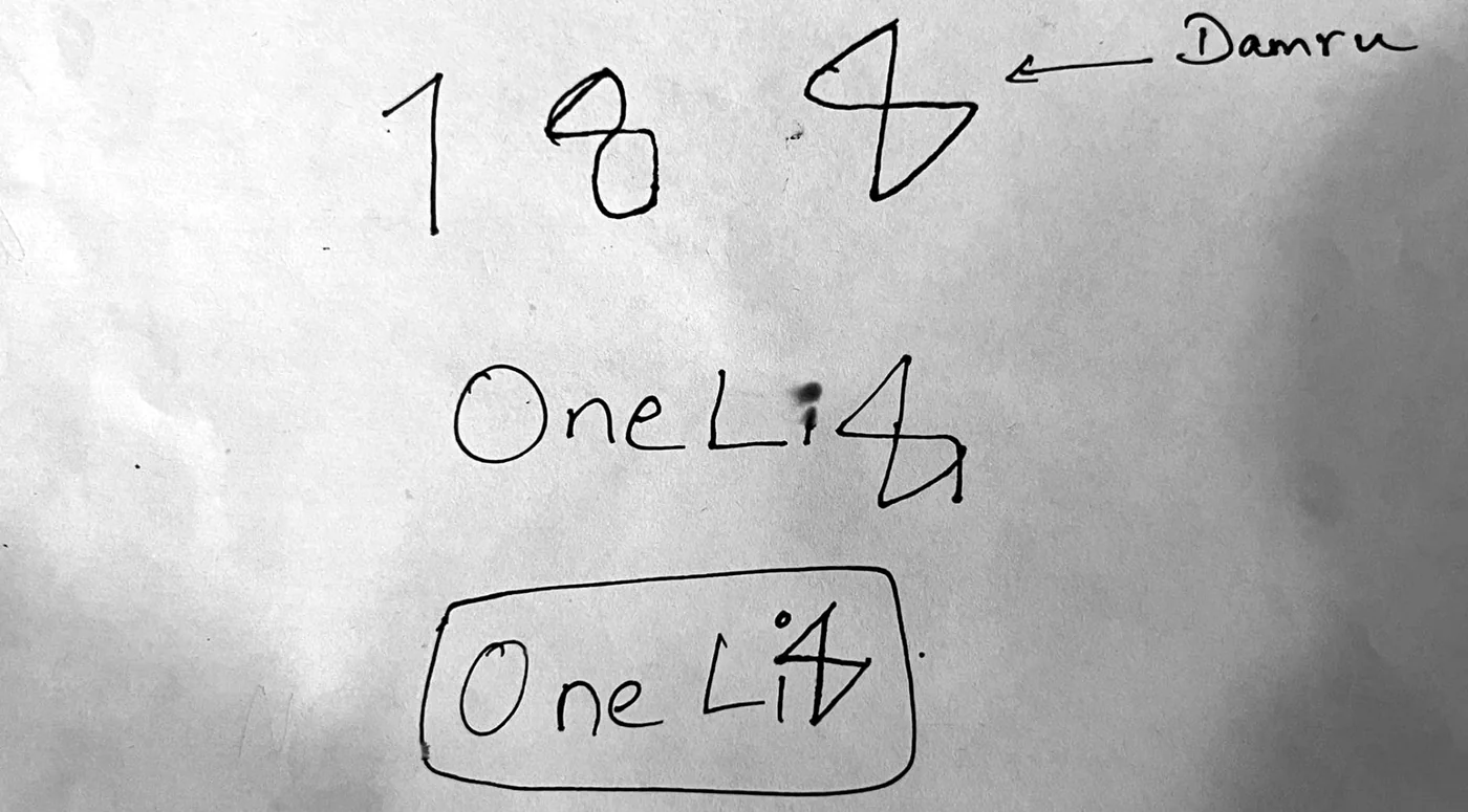
It began as a pen sketch: a 1, an 8, and the 8 redrawn as a damru, two triangles meeting at a single point. Read together, One Li8 is One Light.
My original sketch
1234
One and eightA 1 and an 8: One Li8 reads as One Light.
The damruThe 8 redrawn as a damru, two triangles meeting at a single point.
The wordmarkThe damru takes the place of the 8 in One Li8.
The contained markThe same wordmark set inside a rounded frame.
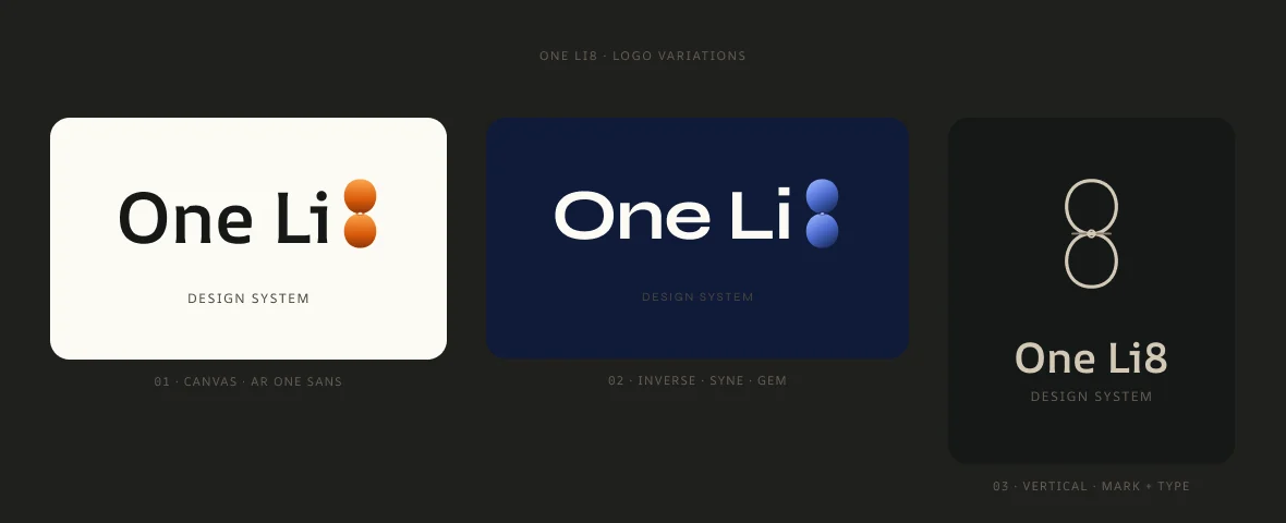
Figma · Explorations built from the sketch
123
CanvasAR One Sans on a warm canvas.
InverseSyne on navy, with a Gem finish on the mark.
VerticalThe 8 on its own, above the wordmark.
The system is inspired by the teachings of Guruji Shrii Arnav and the 9×12 Way. Six principles guide every decision, and they ship inside each package as PRINCIPLES.md.
ServiceClarityHarmonyProportionRestraintEvolution
03 / One Li8
Naming borrowed from Sanskrit
Token names follow a grammar borrowed from Sanskrit rather than a CSS convention. Two rules explain every name in the system.
--ol8namespace-colorcategory-actionprimaryone role, one word-defaultstate
RULE 1
A compound that names one thing is one word.
Sanskrit joins words into a compound when they name a single idea. actionprimary is one role, not action plus primary; writing action-primary would suggest two things where there is one.
actionprimarycutedgeinnerwidthRULE 2
A qualifier stays separate from what it qualifies.
In the Gem control token, hover is a state applied to start, so it keeps its hyphen. That is why disabledcontent is joined and hover-start is not.
--ol8-material-control-gem--primary-hover-start
Hyphens separate levels of the hierarchy, never words inside a level. No abbreviations, no truncation.
The grammar is the rule; the record is the spelling.
Every Figma variable carries an explicit code name, recorded verbatim in figma-code-syntax.txt. The build reads that record instead of re-deriving names from the grammar, because guessing is how design and code drift apart.
04 / One Li8
Three laws, one owner per decision
Composition, ownership and measurement each get their own law, so a change has exactly one place to happen.
OneLi8 ModularityGoverns ownership: reuse or extend an owner before inventing another.
Numerical atomicityGoverns measure: a 3px construction rhythm and one shared 1.8 icon stroke.
170PrimitivesA value · color-blue-600
→
270Semantic rolesA decision · actionprimary
→
161Component rolesA decision applied to one part
Each tier may only reference the one above it, and the build refuses a component token that reaches straight for a primitive. npm run check enforces the rest: margins belong to parents, atoms compose nothing, and every pixel token sits on the 3px grid.
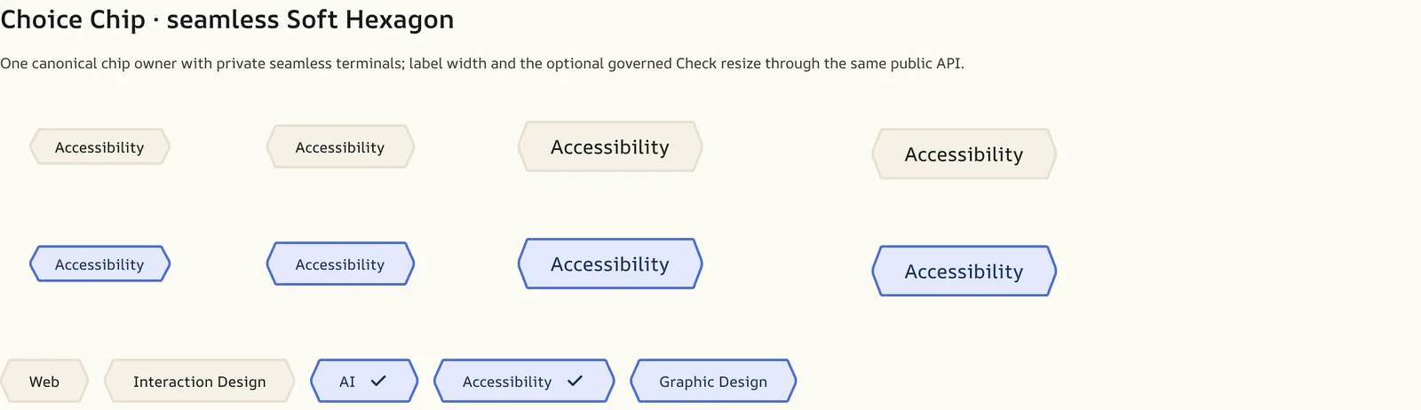
Figma · Choice Chip · seamless Soft Hexagon
123
One geometry ownerA fixed 12-unit terminal, a rail that grows with the label, a mirrored terminal.
SelectedCarried by a stronger edge and native checked state, not colour alone.
The mark follows the labelCheck and Remove share one position, so peer tokens stay aligned.
05 / One Li8
Gem Morphism: a material study
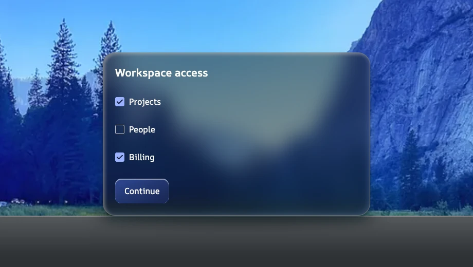
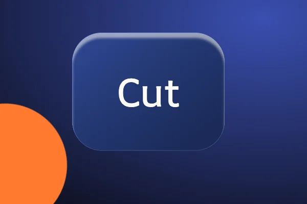
Gem Morphism is One Li8’s own material for transparent, glass-like surfaces, the way Liquid Glass is Apple’s. It was inspired by a gem slab resting on a surface in an open landscape, and it is a transparent material skin, not a separate component anatomy, guided by four qualities: Cut (bezel and edge), Color (semantic tint), Clarity (legibility) and Carat (appropriate visual presence). Facets are rare accents, not decoration.
Gem slab · One Li8 bezel and tokens, real @oneli8/core components
12345
Cut edgeThe bezel: a cut-edge border with a light inset bevel from the top left and a tinted one from the bottom right.
Environmental faceA translucent face with backdrop blur keeps the landscape present behind the slab.
Light contentNear-white text on the slab, with contrast checked against the actual backdrop.
Real componentsChoice Item checkboxes and a Gem primary button from @oneli8/core.
Cut-edge shadowA soft shadow seats the slab on its surface.
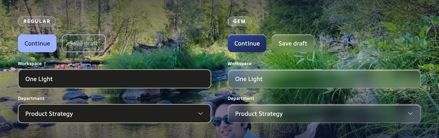
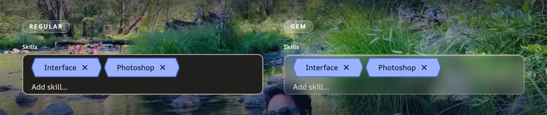
In One Li8, Gem is a material skin, not a second component. Regular and Gem share structure, measurements and behavior; only the surface changes. Everything that follows is rendered from real One Li8 components.
CutOn a control, Cut is the specular rim along the top edge.ColorA semantic tint that follows the primary family: blue, orange, green.ClarityNear-white content; contrast is checked against the real backdrop, light or dark.CaratAppropriate visual presence at every control size.
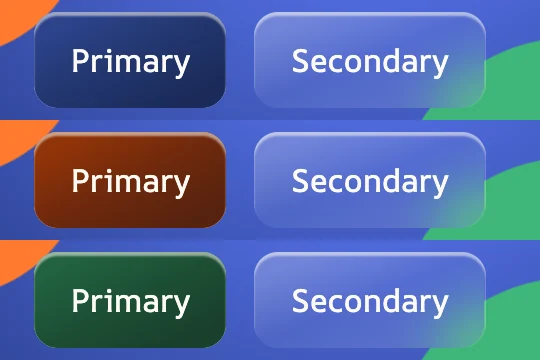
Regular vs Gem · @oneli8/core components on the same photo backdrop
1234
Primary · same-hue bodyA three-stop gradient on to bottom right under a specular top rim.
Secondary · transparent bodyThe 2px boundary drops; an integrated light rim replaces it.
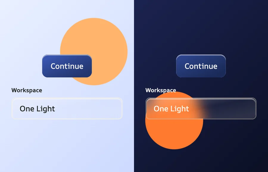
Text Field · frostedThe backdrop blurs behind the control and the cut edge draws the outline.
Select · same ownerSame field anatomy and behavior; only the surface becomes Gem.
Decision: Gem is an adapter on the component, never a fork of it.
θ = 90° + atan(W / H)
Figma bakes a gradient angle into every Gem instance: 153.16° at 83×42, 151.66° at 89×48, 149.29° at 101×60. All three fit this formula, which is exactly what CSS’s to bottom right computes, so the Gem body holds at any label width where a fixed degree would not.
Rules that execute
Gem is approved for Primary and Secondary buttons only, so renderButton throws for Gem on Quiet or Destructive. An Icon Button without an accessible name throws too. The design constraint is an error, not a review comment.
06 / One Li8
Material studies across themes
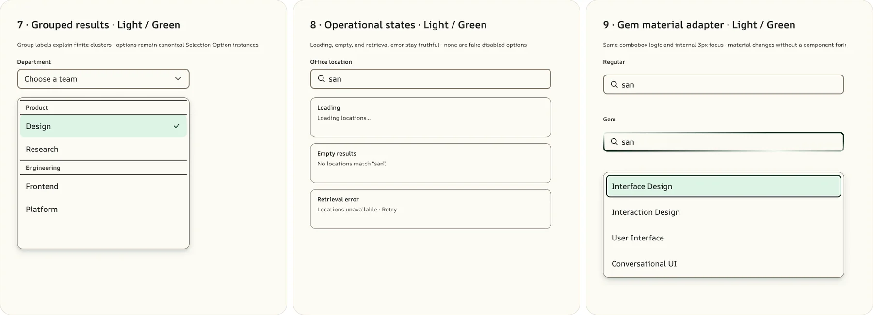
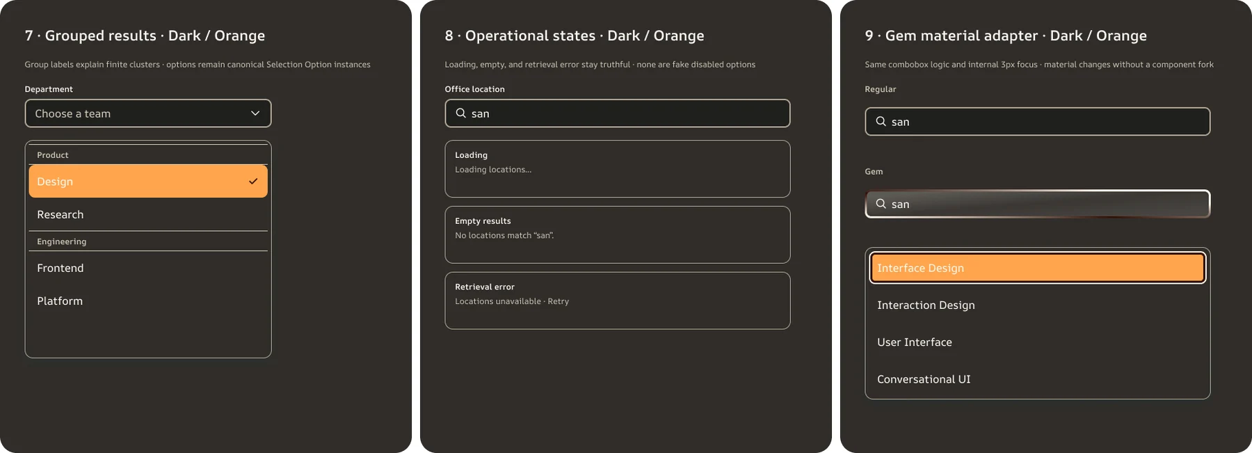
Nine compositions informed by real products on Mobbin, translated through One Li8. References guide behavior and information density, never visual identity.
Operational statesLoading, empty and retrieval error stay truthful, never fake disabled options.
Regular fieldThe combobox with its internal 3px focus.
Gem fieldSame logic and focus; the material changes without a component fork.
Theme and primary color are independent attributes that compose: data-ol8-color-scheme for light or dark, data-ol8-primary for blue, orange or green. Dark remaps 86 semantic roles. Because roles are emitted as references, repointing a ramp repaints everything that reads it.
Regular vs Gem · Multi-select Field
07 / One Li8
Accessibility written as rules, not reminders
WCAG and WAI-ARIA live inside One Li8’s knowledge graph, ai-context.json, as invariants every component carries. People and AI collaborators read the same rules, and code that breaks them fails instead of shipping.
WCAG 4.1.2 · NAME, ROLE, VALUE
No name, no button.
renderIconButton throws without an accessible name, and hydration reports any unnamed button already on the page. A loading button keeps its label in the DOM and carries aria-busy, so its name never changes mid-action.
aria-labelaria-busyWCAG 2.5.8 · TARGET SIZE
The target outlives the box.
An Icon Button is two boxes: a transparent protected target and the visible surface inside it. At Compact the surface is 36px while the target stays 48px. Merging the two would shrink the target to 36px, so the split is the component.
target 48pxbox 36pxWCAG 2.4.7 · FOCUS VISIBLE
Focus is never removed without a replacement.
Buttons draw their focus ring inside the edge, so an overflow parent cannot clip it and the control keeps its measured size. Icon Buttons draw a two-tone ring from the two focus tokens. An outline-based focus style is forbidden by the system’s rules.
:focus-visible--ol8-color-focus-outerWAI-ARIA · NATIVE FIRST
Native semantics before ARIA.
A Choice Group is a real fieldset and legend with radios that share a name, so arrow keys, single selection and form submission come from the browser. Adding a radiogroup role is forbidden, because it would override semantics that already work.
Options are never focusable. The active option is a virtual cursor carried by aria-activedescendant, so caret, composition, dictation and undo keep working in the native input. Escape closes the list and restores the committed value.
aria-activedescendantaria-labelledbyWCAG 1.4.1 · USE OF COLOUR
Selection is never colour alone.
A Choice Chip is a real checkbox, so selection is carried by native checked state and a stronger edge. In a Multi-select Field, tokens are not tab stops: arrow keys walk them, and removal takes two presses so a stray Backspace cannot drop a value.
input:checkedTab → arrows
Every user preference is honoured
Reduced motionLinks, text fields and navigation items drop their transitions to the instant duration token.
Forced coloursLinks, text fields, navigation, the segmented control and the selection popup hand colour back to the system palette in High Contrast.
Reduced transparencyGem hides its glass layers and shows the regular opaque button beneath; Secondary regains its 2px boundary.
Contrast is measured, not assumed. Where Figma’s own bindings failed WCAG 1.4.11, the code fixed them at the source, and the measurements are below.
08 / One Li8
Parity you can check, released as open source
Every component comes from a component set in Figma, and React and Core are checked against each other on every build, so the two cannot answer differently about a role, a name or a state.
Where Figma was wrong, code fixed it at the source
Icon Button glyph on Primary1.94:18.81:1
Icon Button glyph on Destructive2.17:17.88:1
Selected Radio indicator1.16:18.81:1
Built for AI collaborators as well as people: AGENTS.md, llms.txt, ai-context.json and three skills for UI composition, icons and Figma-to-code travel with the repository.
Open source · 1.0.0-beta.93 npm packagesFigma libraryApache 2.0