AT&T · REVERSE SUPPLY-CHAIN ANALYTICS · DESIGN SYSTEMS
Enterprise supply-chain analytics
Making hundreds of dashboards behave like one product.
Hundreds of Tableau dashboards rendered inside a PHP shell, commissioned separately by ten lines of business that had never shared a rule. I built the navigation, the tab system and the documented design system that made three rendering surfaces read as one product.
My role
Design system · navigation · complex data viz · usability testing & UAT
Scale
~400 dashboards · 10 lines of business
Timeline
May 2022 – Aug 2023
Documented for
PHP · Tableau · Power BI
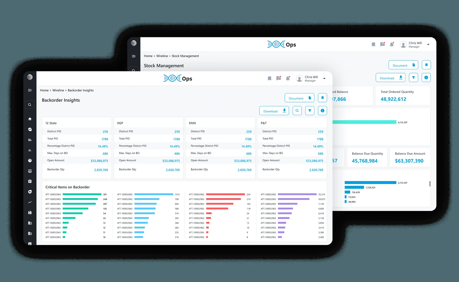
The portal after the redesign.01 / AT&T
Where I came in
The platform is where AT&T’s reverse supply chain is measured — what comes back, what is held, what moves, what it costs.
It is a web portal of modules, and every module opens a Tableau dashboard rendered inside a PHP page. That one sentence contains most of the design problem.
I joined Xcaliber as the fourth person in a design team of three, scattered across projects. It grew to six, then nine. On this platform the design team was two.
I reported to the project manager at first. A lead designer was onboarded later, and a proper design function started forming around that.
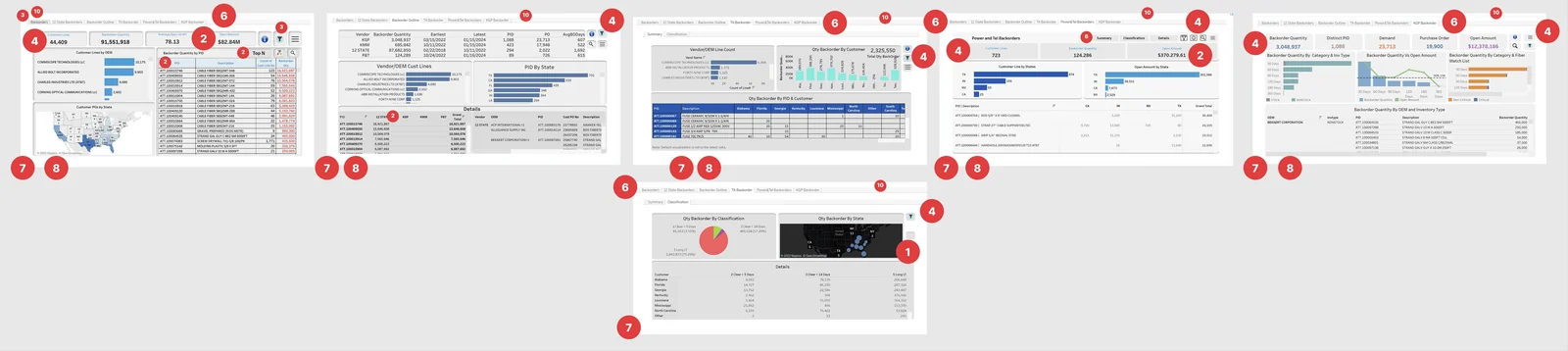
The portal had grown by accretion — every module commissioning its own dashboards to whatever taste was in the room.
Read as forty separate products, nothing was wrong. Read as one product, the damage fell along three fault lines, and each pointed at a different part of what I had to build.
Fragmented dashboards
Problem
Four hundred dashboards, built independently, sharing no design language and no navigation.
Impact
KPI definitions varied by team. The numbers themselves became arguable.
Opportunity
One portal, one component system, every line of business.
Operational complexity
Problem
No discoverability, no governance, and a platform that kept scaling anyway.
Impact
Overhead on users hunting views, and on admins managing access by hand.
Opportunity
Discovery and role-based access inside the framework.
Executive visibility
Problem
No single place to see performance. Every review began with a manual report.
Impact
Decisions arrived late, and in pieces.
Opportunity
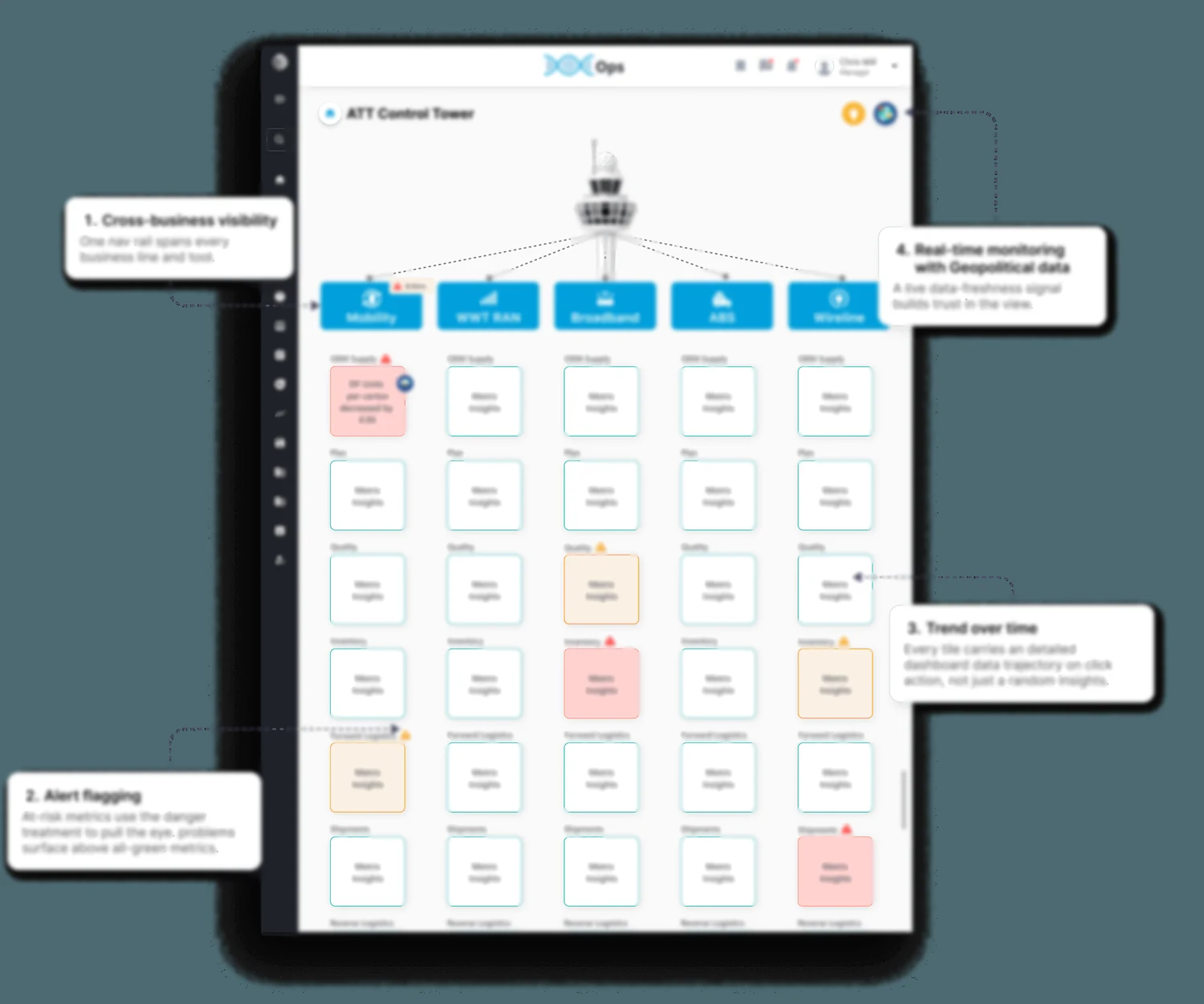
One executive view — scorecard and control tower.
So how does a portal of four hundred dashboards, built by people who never spoke to each other, start behaving like one product?
03 / AT&T
Who was it for?
AT&T executives, and the people who answer to them.
Each executive owns a different line of business, brings their own stakeholders and their own taste, and works through a business analyst who pulls the data for them. Multiply that by ten and the real problem appears: not one client, dozens — each with a legitimate claim on how their screen should look.
Below them the portal serves operations teams who work in it daily, and the analysts who build the views. One product, three altitudes, and a system that has to survive all three.
DECIDEExecutive leadershipWhole-business visibility on one screen. Reviews start from the board, not from a consolidated spreadsheet.EXPLAINBusiness analystsOwn a module each. They bring the data and the story it is meant to tell, and answer for it upward.OPERATEOperations teamsIn the portal every day. They need the right dashboard fast, and the same rules on every one of them.
04 / AT&T
How I worked across the org
A client this size does not hand you a brief. It hands you a cast.
The analysts arrived with the data and the story they thought it told. Often the stronger dashboard was already sitting in that data — a different cut, a different comparison, a different chart doing the work. Proposing those changed what the dashboard was, not just how it looked, and it is the part the analysts kept coming back for.
Nothing shipped until it matched the system. That gate — visual sign-off at QA, plus usability testing and UAT before release — is what made the system real rather than advisory.
MEProduct designerNavigation, components, the system, the scorecard — and the visual sign-off.DESIGNJuniorsTwo mentored, working inside the system rather than around it.DATABusiness analystsOne per module. Requirements, data and the argument it should make.BUILDDevelopersTableau and PHP. The rules had to be buildable by them, twice.DECIDEStakeholdersProduct and leadership, each with their own module and their own taste.
AnalystBrings the data and the story it should tell
MeMakes it legible — value, direction, comparison
DeveloperBuilds it to the written standard
TestUsability testing and UAT before release
Dozens of stakeholders, ten lines of business, four hundred dashboards, two designers. That arithmetic is the whole argument for a system.
05 / AT&T
How did we know what was broken?
Reviewing four hundred dashboards in detail would have eaten the project before it started.
So we asked leadership and the analysts which dashboards people actually open, took the most-used one from each line of business, and scored those against the same rubric.
The point was never a complete inventory. It was to find what breaks everywhere, so the fix could be built once.
Sampling for impact, not coverage
AskWhich dashboards carry the daily load
SelectTop-used view per line of business
ScoreSeverity 0–4, one rubric
AggregateWhat breaks everywhere, not once
TranslateEach finding into a requirement
Heuristic
Severity
What the system had to provide
Visibility of system status
3.5
Loading & error statesData freshness
Aesthetic & minimalist design
3.4
Exception-first hierarchyTrend indicators
Error prevention
3.2
Persistent filtersActive-state confirmation
Recognition over recall
3.1
Threshold colourContextual wayfinding
Consistency and standards
2.8
Unified systemSemantic tokens
Match system & real world
2.6
Business languageGoal lines
User control and freedom
2.4
Filter resetUndoSaved views
Flexibility and efficiency
2.0
ShortcutsPersonalisation
What it decided
Consistency scored badly everywhere, so the system got built before any dashboard was redesigned. Status visibility was the worst single heuristic, so data-freshness signals went onto every dashboard that could carry one. And exception-first hierarchy — what is wrong above what is fine — became the layout principle for everything leadership would later see.
06 / AT&T
How does anyone find the right dashboard?
At four hundred, the question stops being how a dashboard looks.
It becomes whether a person can find the right one twice, without being told, having learned nothing new in between. Before the redesign they navigated by memory — so every new dashboard was a new route to memorise.
The portal had to answer three things at once: where am I, what else is here, and how do I get back. Each module had been given its own answer to all three.
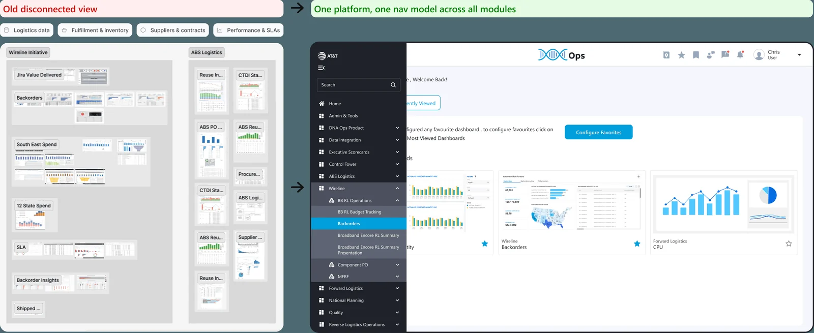
Old disconnected view
Modules that did not know about each other. Each its own island, with its own idea of where things live.
One nav model
A single model across every module — modules became its vocabulary rather than its exceptions.
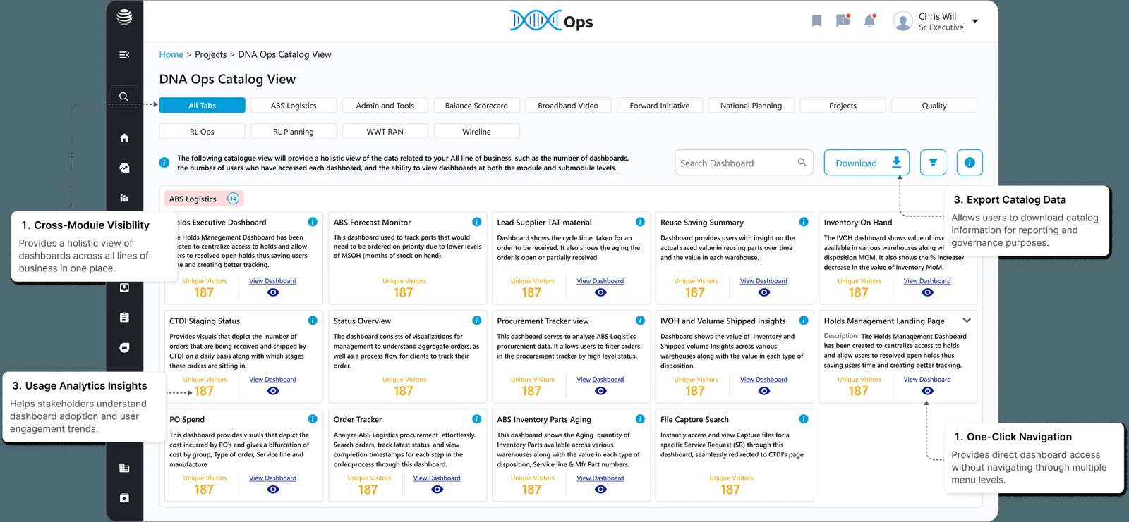
Findable by purpose
Every dashboard listed by line of business and what it is for, so discovery does not depend on knowing the name.
One click in
Any dashboard is one action from the catalogue — no hunting through module menus.
The decision
Fix the route before decorating the destination.
07 / AT&T
How do you know where you are?
Out of the navigation work came the piece I am proudest of.
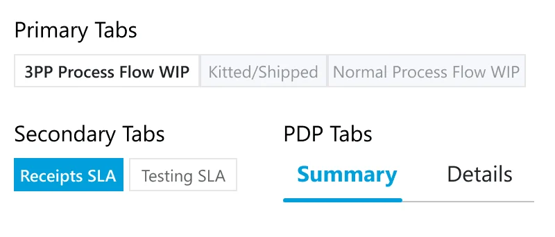
Three levels of tab, each with its own treatment, so the control tells you what kind of move you are making before you read the label. The rule matters more than the styling: a tab may only ever do one of those three jobs.
Learn one dashboard and you have learned the next. And all three had to survive being rebuilt as Tableau configuration by a developer who had never opened the Figma file.
Primary
A segmented control holding the top-level states of a process. The active tab carries full-strength text and the rest recede, so the set reads as one switch rather than three buttons.
Secondary
A filled pill against an outlined one. Higher contrast than the level above, because this one changes the data in place rather than moving you somewhere.
PDP
On a detail page, an underline pair with no container at all. It sits inside content, so it stays quiet and never competes with the two levels above it.
08 / AT&T
What happens when Tableau says no?
My canvas was not a canvas.
Every dashboard is Tableau, rendered inside a PHP page, and Tableau decides what a container can be. No curved corners. Constrained spacing, states and type. A component in a design tool is a component; in Tableau it is a configuration somebody rebuilds by hand.
So I took the platform’s constraints as my own and designed to them deliberately, rather than drawing something beautiful and handing the developers an argument they could not win.
No curved cornersConstrained spacingLimited statesType you do not controlA component is a configuration
The loop
Draw the rule → build it in Tableau with the developer → find where it breaks → redraw → write it down. Trial and error as a method, not as a failure.
A hard limit kills the decorative options early. What survives is structural — which is what a dense data product needed anyway.
09 / AT&T
How does a metric mean the same thing everywhere?
With the route fixed, the furniture.
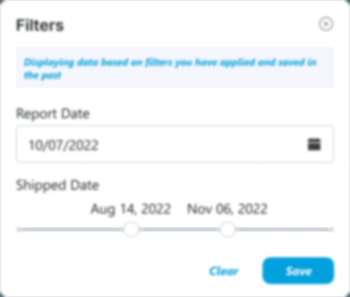
Filters, notifications, banners, KPI cards, tables and chart patterns — each specified once and used everywhere, in both directions at once: the design intent, and the configuration that produces it.
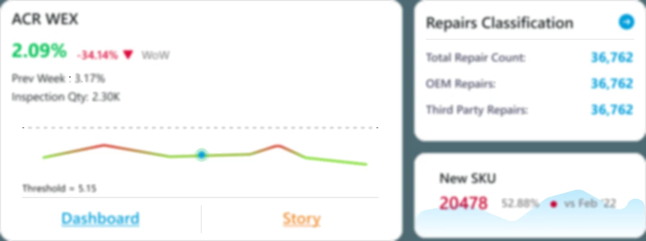
Every metric pattern had to answer the same three questions on sight. What is the number. Is it good. Compared with what. Once those were settled as patterns, dashboards stopped inventing their own answers.
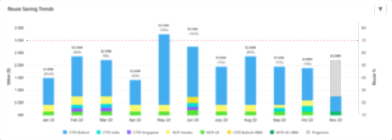
Filters and saved viewsKPI cardsTrend patternsComposition patterns
10 / AT&T
How do three technologies look like one product?
The part that outlived everything else.
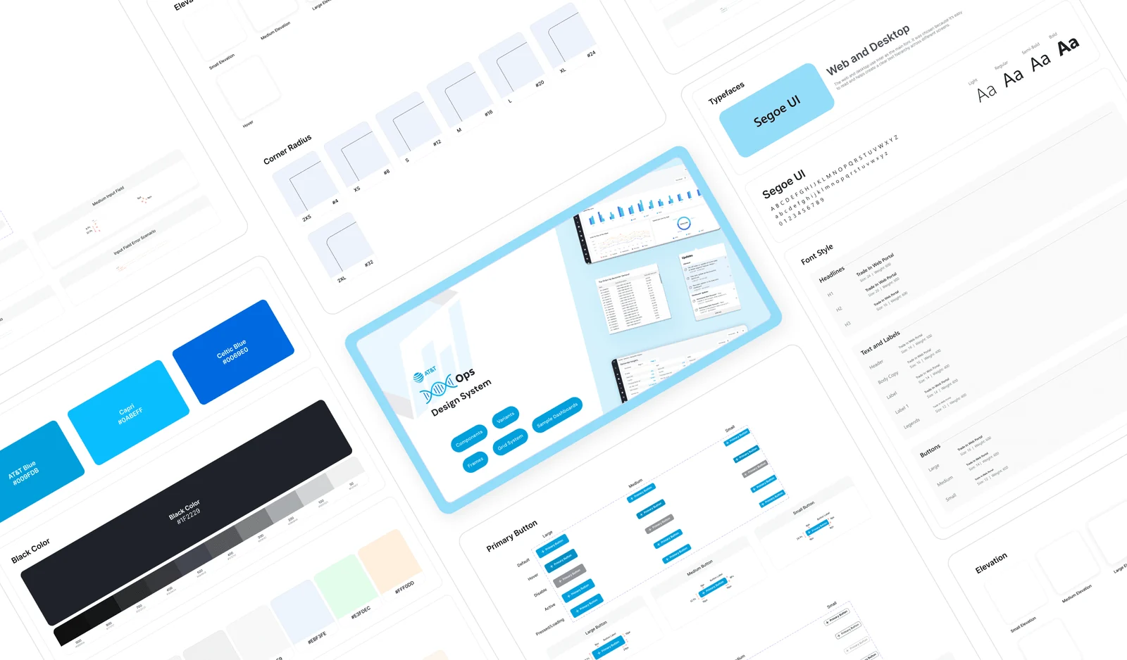
Not just a library — a library plus the written rules for using it, because a component nobody knows the rule for is only a suggestion. It was documented three ways: PHP components for the portal, Tableau components for the dashboards, and Power BI next, for the sister platform.
The goal was that a user moving between a PHP screen and a Tableau dashboard should not be able to tell which one they were looking at. Matched to the best of what each could do, rather than levelled down to the weakest.
With it in place a junior could produce a correct screen in their first week, and two designers could work across different analysts without the product drifting apart.
Components, templates, states and KPI patterns in one place
PHPPortal componentsShell, navigation, filters, banners, notifications. The one surface with full control.TABLEAUDashboard componentsThe same patterns as configuration — and what to do when Tableau refuses.POWER BIPlanned nextWritten to extend, so a merge would not mean a third visual language.
SEMANTIC COLOUR
PrimaryAccentInteractiveSuccessWarningAlert
TYPE · SEGOE UI
DisplaySection headingBody copy for dense data productsLABEL · UPPERCASE
10lines of business
400dashboards
3rendering surfaces
5user roles
11 / AT&T
What does leadership actually see?
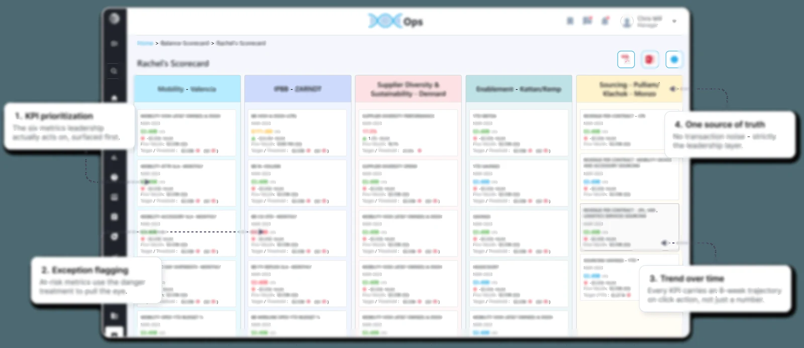
I was primary designer on the executive scorecard.
It was built for a director who needed her entire operation on one screen. Information density was the requirement, not a failure state — she asked for everything at once, so the work was never to reduce what is on the screen. It was to make that much information navigable.
Colour does the heavy lifting. Each one belongs to a person on her team and the module they run, so she reads one board and knows not only what is failing but whose area it is in. That turns a reporting screen into a delegation instrument.
It is also why the palette had to be fixed in the system first. Reassign a colour on one dashboard and you have quietly reassigned a person.
Strategic KPIs
Initiative health and risk on one surface, so a review starts from the board rather than from someone’s spreadsheet.
Colour is ownership
Every colour maps to a person and their module. Failure has a name attached before anyone opens a detail view.
Exception-first
The principle the audit produced: what is wrong surfaces above what is fine, so a calm board means a calm business.
One rail
Every line of business on a single view, with detail one click away rather than one module away.
Same components, same colour meanings, same tab grammar, from a warehouse screen to a leadership review.
12 / AT&T
Features the requirements did not ask for
Found by watching people work, not by reading a specification.
A platform is also not only its charts — the states and the imagery around them are what make it feel like a product rather than a report viewer. That layer was mine too.
PERSONALISATIONFavourite dashboardsPeople hunted the same reports every morning. Pinning turned a daily search into a click.ONBOARDINGGuided tourNew users could not discover what the portal did. The tour cut the learning curve where it bit.CONTINUOUS IMPROVEMENTFeedback moduleNo channel existed for requests or issues. It became a live loop between users and the product.ADOPTIONNewsletterNew capability had no route to the people using the platform — which is how good features stay unused.
Empty statesLogin & entry screensIllustrationsError states
13 / AT&T
Beyond the dashboards
Reverse supply chain is not only reporting.
Devices come back in their thousands, and each has to be unlocked, wiped and certified before it can move again. Different surface, same discipline: a certificate and a KPI card have the same job — make a claim, and make it verifiable at a glance.
The platform also earned a mark of its own. The helix is drawn from chart bars rather than illustrated, so it belongs to the thing it labels, and it holds up small — which is where a product mark actually has to work.
Unlock portalThousands of handsets connected for erasure at once, which makes batch state, progress and failure the entire design problem.
Erasure certificatesThe document proving a device was wiped. A legal artefact before it is a design one, so hierarchy, evidence and trust do all the work.
The mark I designed for the platform — a double helix built from the bars of a chart14 / AT&T
From fragmentation to a system
The change landed at platform scale, and across the people and teams depending on it.
None of it was a redesign of any single screen. All of it followed from deciding the system first and defending it at the QA gate.
User experience
Improved dashboard discoverability
Less switching between dashboards
Faster KPI identification
Consistency across every line of business
Team impact
A shared design language
Faster implementation cycles
Stronger designer–developer collaboration
Juniors productive in their first week
Business impact
Centralised reporting experience
Better operational visibility
Faster, better-founded decisions
Stronger platform adoption
Platform scale
10 lines of business, ~400 dashboards
Multiple stakeholder groups, one experience
Three rendering surfaces, one appearance
A governance model that held
15 / AT&T
Key learnings
Not the screens. The order of operations.
Most of what this project taught me is about what happens before anything gets drawn — and about the unglamorous half of a design system, which is the writing.
Enterprise UX is systems design
The hard part was never designing a dashboard. It was building an ecosystem that supports hundreds of them consistently, made by people I would never meet.
Documentation is half the system
A component without a written rule is a suggestion. The docs had to say what it is, how it is built on each surface, when not to use it, and what to do when the platform refuses.
Document the decision, not the outcome
Anyone can redraw a card. Nobody can reconstruct the reason. The decision record is what let the next designer extend the system instead of re-litigating it.
Governance beats good intentions
A system is only real where something enforces it. Ours was the visual sign-off at QA — without that gate it would have been a library nobody opened.
Design to the build constraint
A rule that cannot be implemented is not a rule. Specifying against Tableau’s real limits, with a developer beside me, is why the system survived contact with delivery.
Do not jump to design
Audit, analyst conversations and constraint mapping came first. That is why navigation-first was obvious rather than arguable when I proposed it.
Stakeholder management is design work
You do not win systems thinking in a meeting, especially in a company without design maturity. You ship the artefact that makes the old way obviously harder.
Co-create, don’t collect
Analysts and operators knew what no audit surfaces — which report they open first, what they do when the data is stale, which filter they never touch.
Know what not to do
Every extra control costs a second of comprehension, four hundred times over. Restraint has to be written into the system or it does not survive a deadline.
16 / AT&T
What I would do differently, and the handover
Foundations are meant to be handed over. That is what makes them foundations.
When a second designer joined we split the modules and ran the same loop in parallel — the first real proof the system worked. When I left, he took it on and carried it through its eventual merge with the sister platform into the client’s consolidated intelligence portal.
Version the system properly
We governed by review. Today I would ship the library versioned, with a changelog and a deprecation path, so adoption could be tracked instead of trusted.
Measure before and after
I have the qualitative outcome and not the number. I would baseline time-to-find and time-to-decision at the audit, and re-run it after — the same evidence, in a language the business already speaks.
Test earlier, with real operators
Usability testing and UAT sat near release. Moving a lighter version of both to the pattern stage would have caught in a week what took a cycle.
Write the Power BI spec sooner
The third surface was planned, not proven. Specifying it while the other two were still fresh would have made the eventual merge a smaller conversation.
The model outgrew its product
A sister project took on a major retail client and needed the same kind of tool. I set it up there and trained the designer who took it over. A system that only works where it was born is a style guide — this one moved.
Navigation for ~400 dashboardsThree-level tab architectureDesign system across three surfacesExecutive scorecard, primary designerMethod reused on another clientTwo juniors mentored
Client work for AT&T, delivered at Xcaliber Infotech. Dashboard text is hazed; views containing personal data are not shown. Workstreams I did not design — the ABS/ADB tooling and the AI assistant added later — are excluded.